INDUSTRY:
BLOCKCHAIN
CLIENT:
DITTO NETWORK
YEAR:
2025
EXPERIENCE:
BRAND IDENTITY & WEBSITE
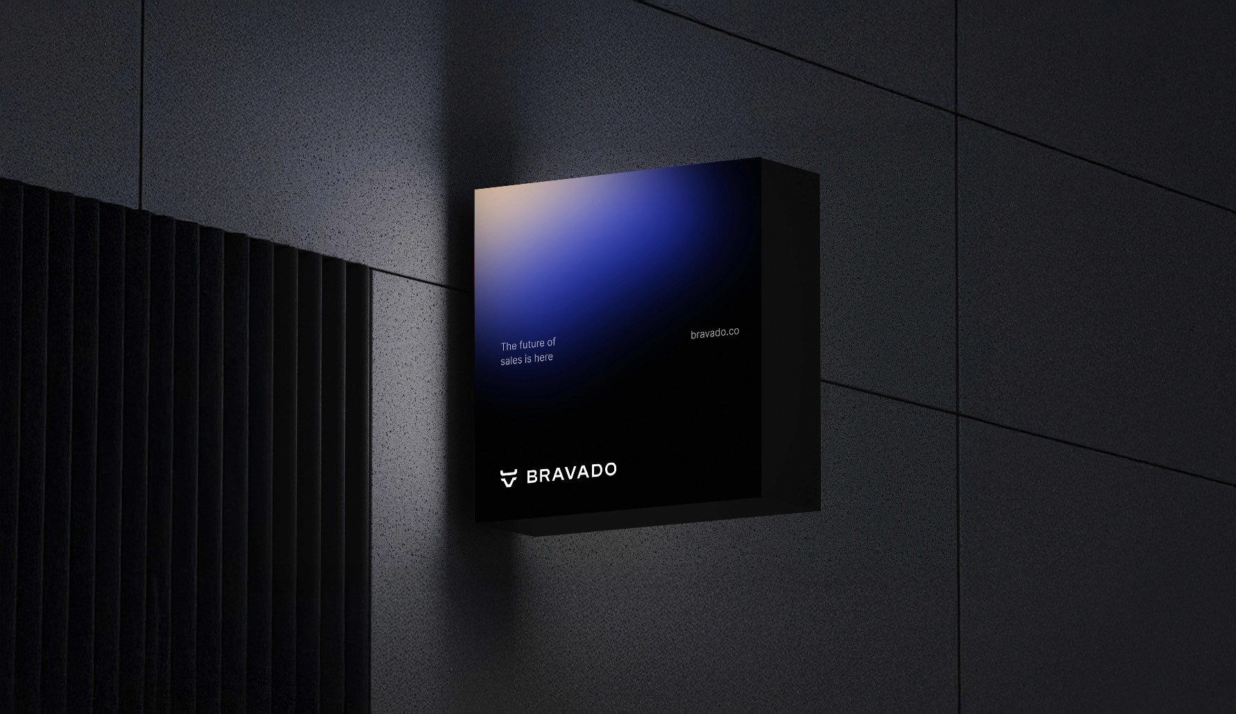
Ditto
about.
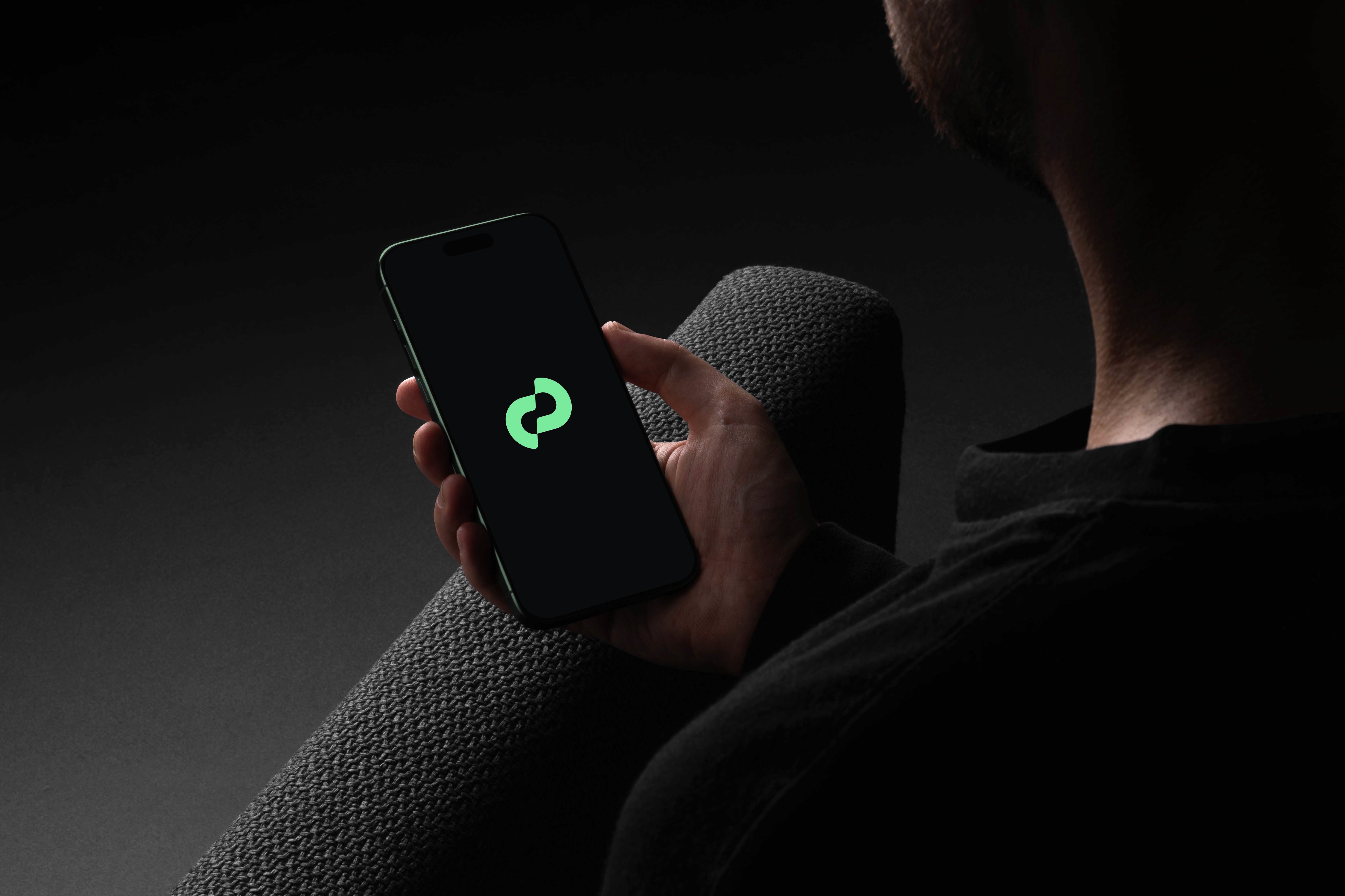
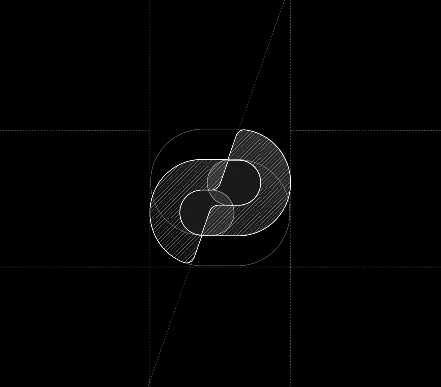
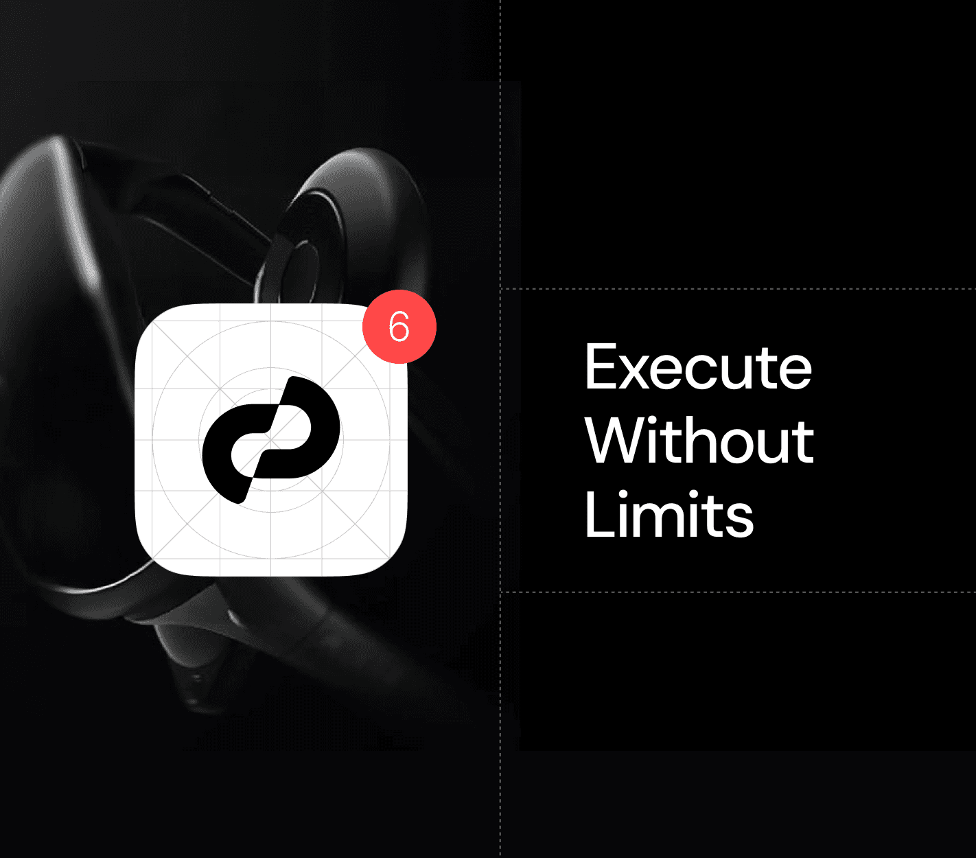
For Ditto, I designed a sleek, minimalist logo built around the letter “D,” with a subtle repeating shape that echoes the idea of continuity — tying back to the brand’s name and identity. The aim was to create a timeless, modern look that feels both professional and approachable.
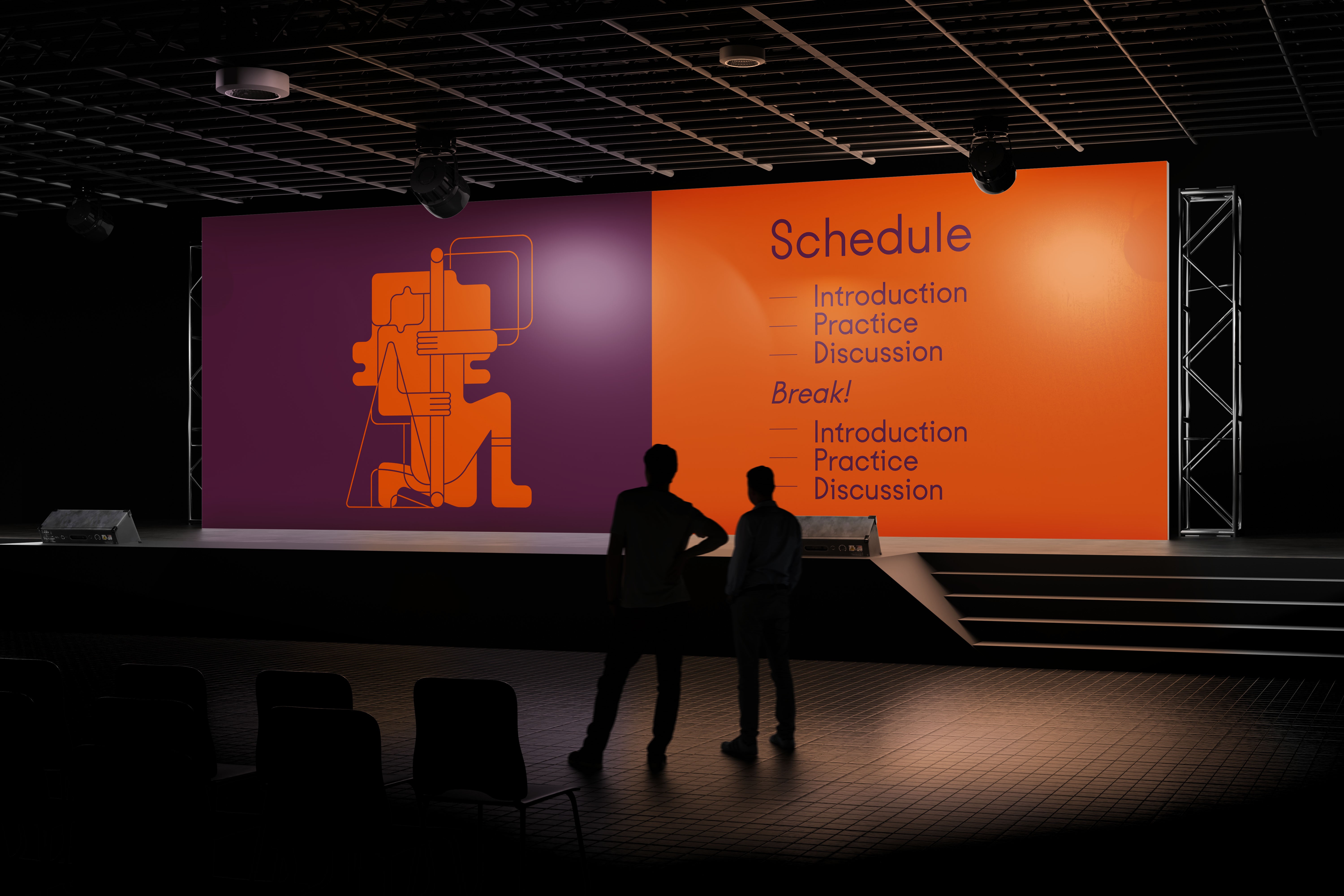
challenge.
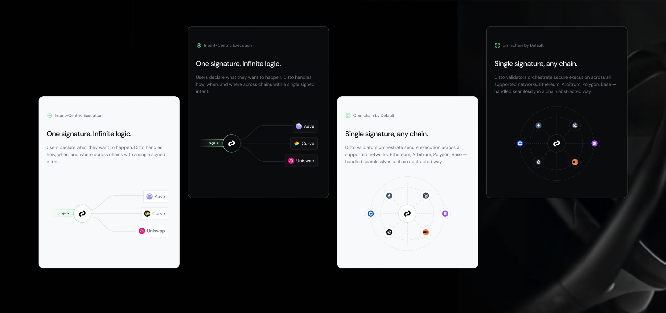
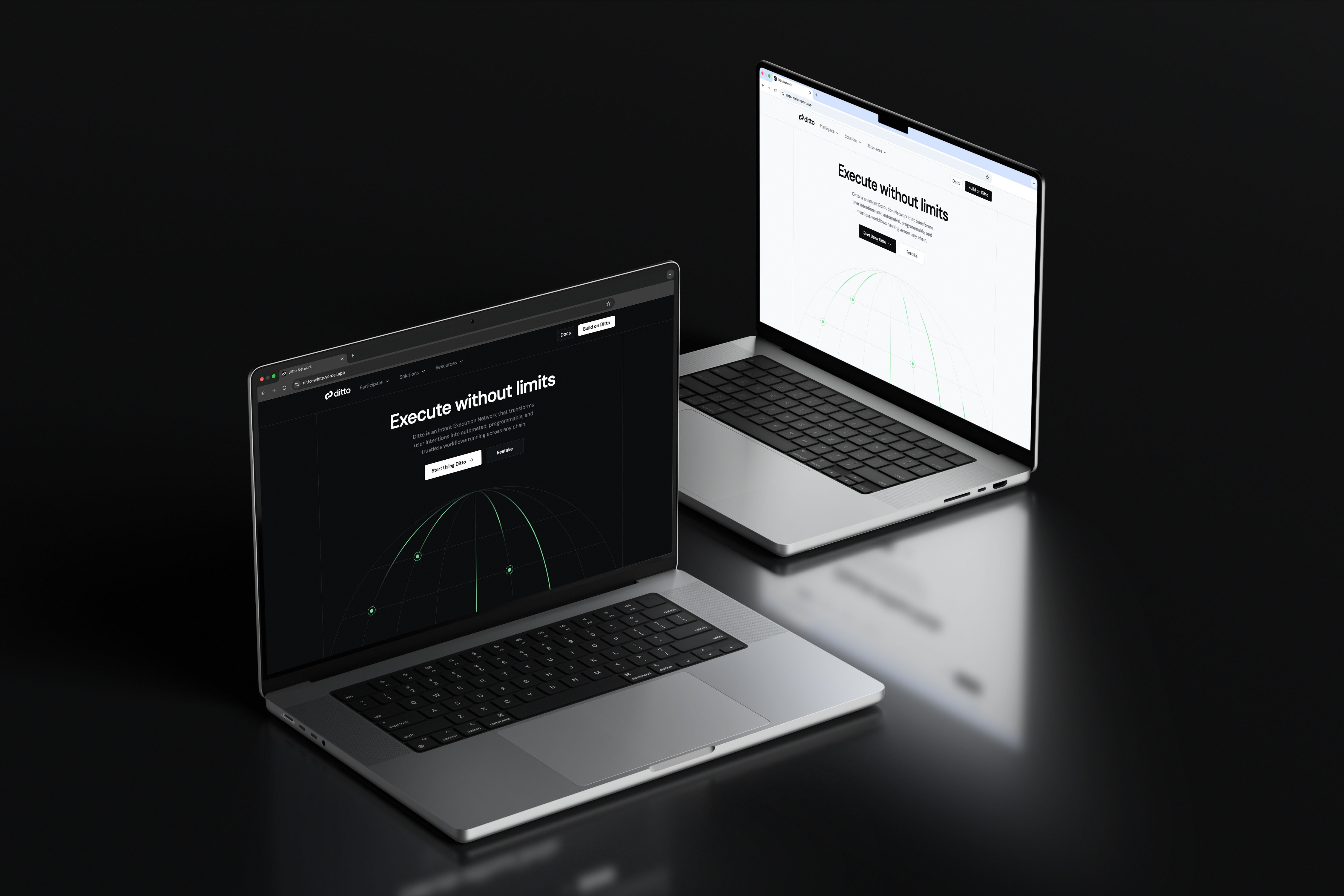
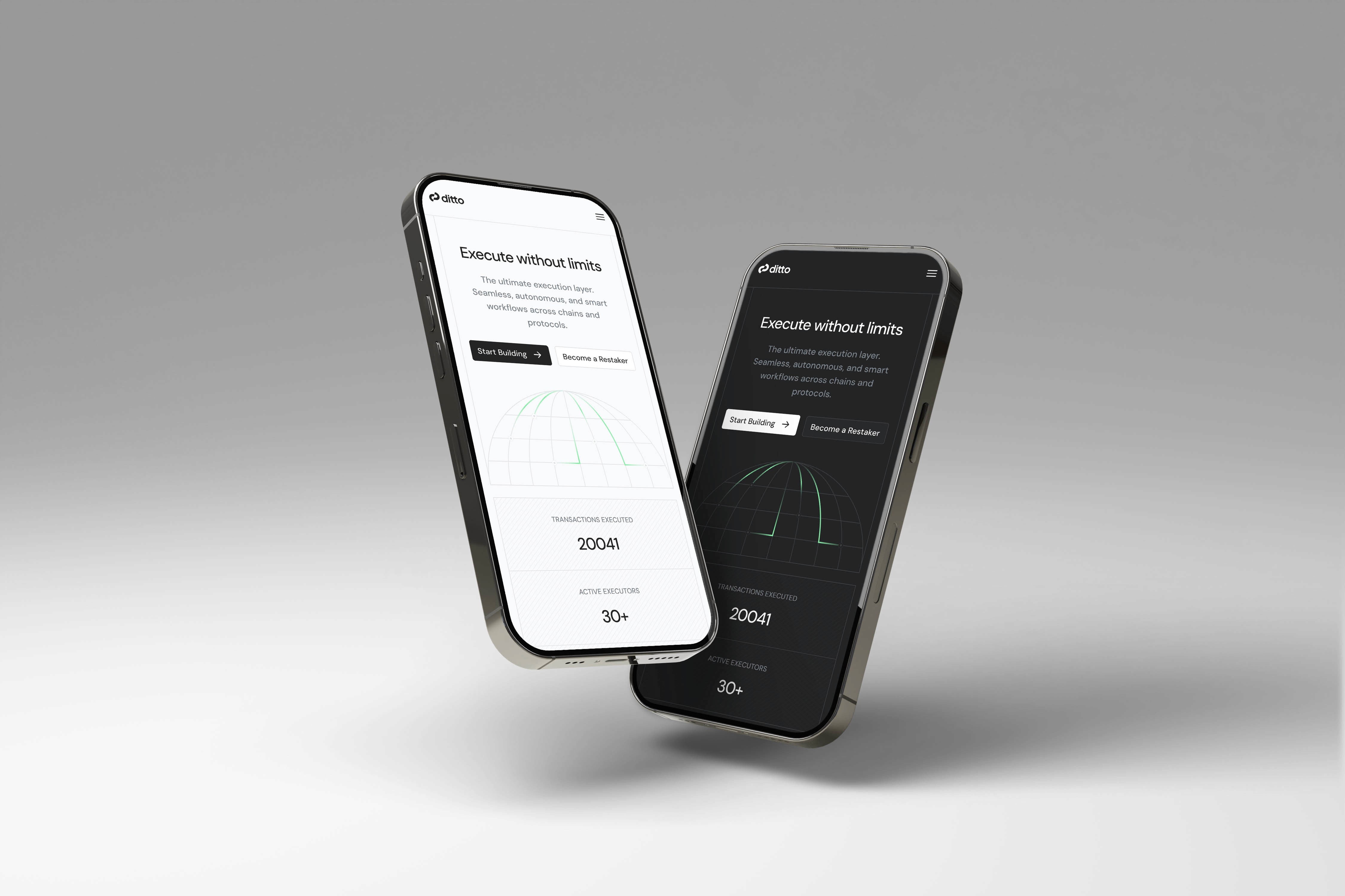
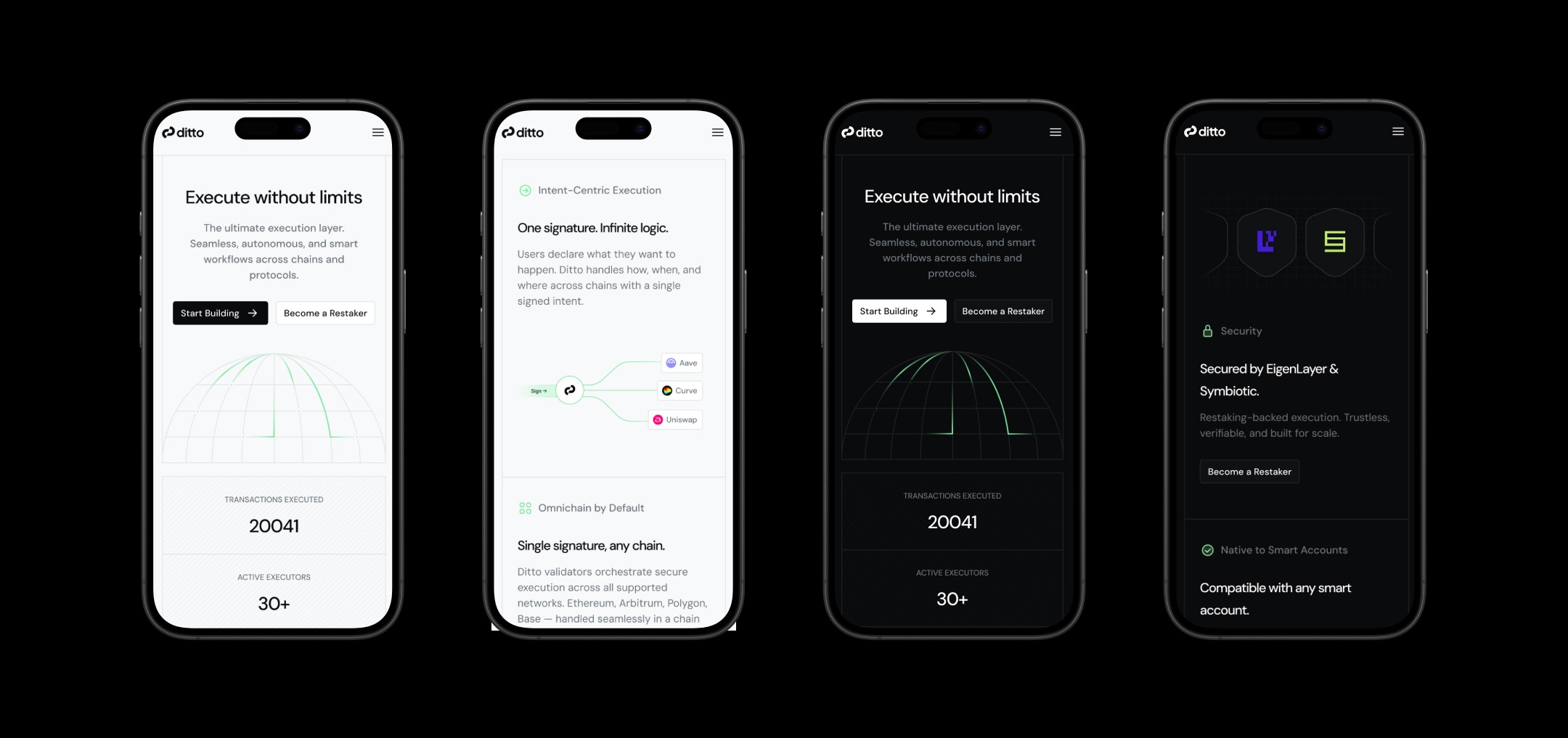
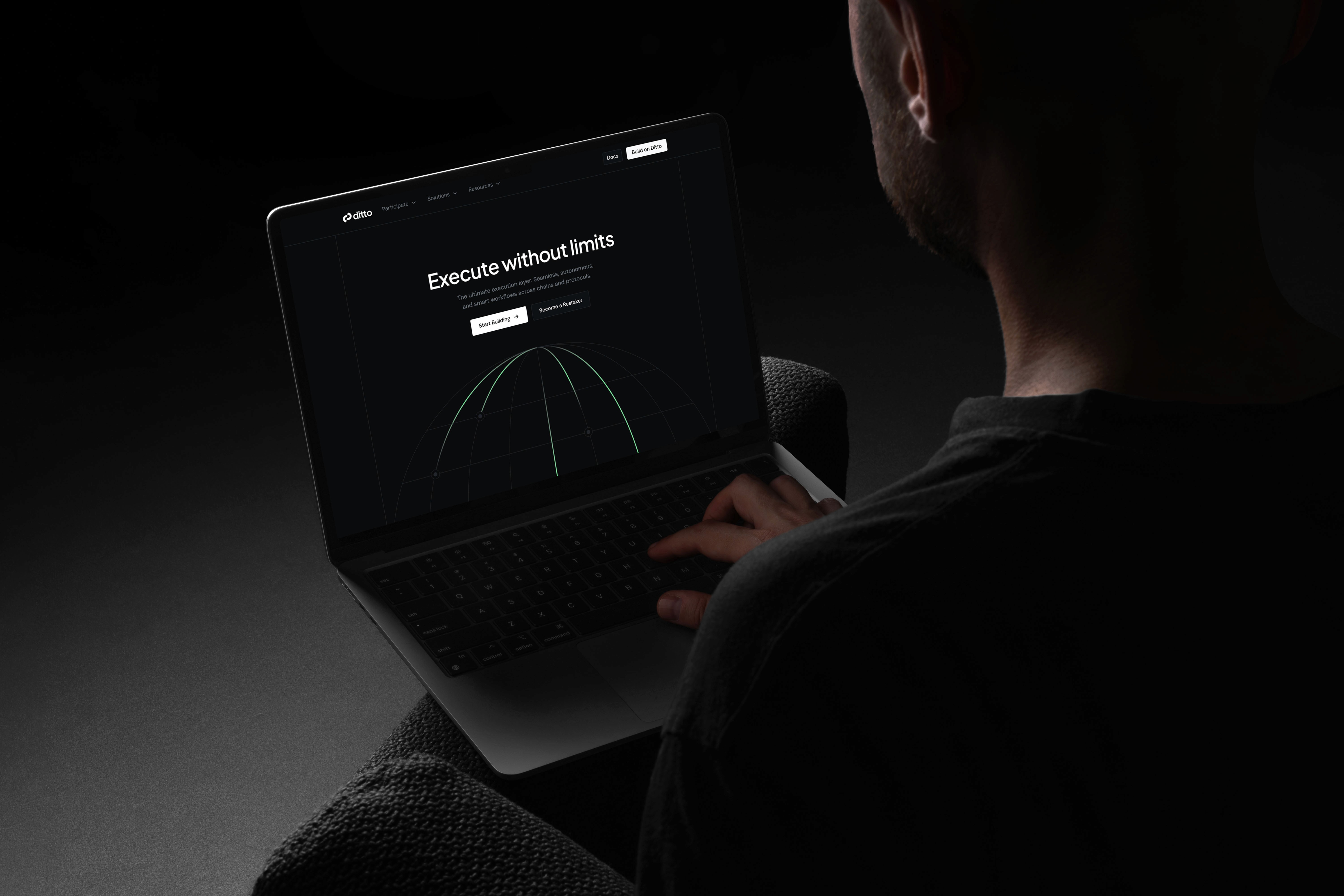
The key challenge was to keep the visual style clean and unobtrusive, allowing the core content of the website to take center stage. The design needed to feel effortless, polished, and user-friendly, while still reinforcing the brand’s personality. One of the key requirements was to develop both light and dark themes to give users flexibility and comfort in different environments.
result.
I developed a flexible design system and created both light and dark themes to ensure an optimal user experience in any setting. The result is a distinctive yet understated identity that elevates the brand, enhances usability, and leaves room for the content to shine.
The branding Daria delivered stands out, feels timeless, and gives us a strong foundation for growth.

Kirill Kovalev
Partner Tenzor Capital